The evolution of the New York subway map since the 1970s

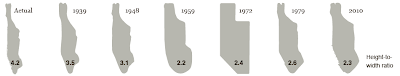
It may be one of the world’s most striking metropolises, but on the map at least, New York City is ugly. With Manhattan looking like a carpenter’s finger and Brooklyn a dead ringer for a burst colostomy bag, the city’s subway map has always had to work on a dirty canvas. Maybe that’s why the transit of this most iconic of towns doesn’t have anything like the brand identity of the London or Moscow undergrounds.
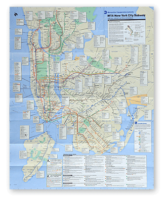
Despite this, I’m still fan of the system, largely because of its elevated sections – most notably shown in The Warriors, when the gang (leather waistcoats and all) have to find their way home via the subway and its most violent passengers. The reason I’m writing about it – though I don’t ever need an excuse to cover an underground railway – is because the local authority have redesigned the system’s map (above).
The New York Times says:
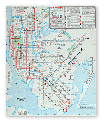
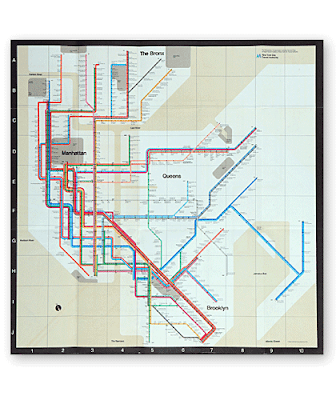
Happily, the paper also showcases the different versions of the map that have been directing New Yorkers for the last 40 years. The different version are below:
1968
1972
1979

1998

It may be one of the world’s most striking metropolises, but on the map at least, New York City is ugly. With Manhattan looking like a carpenter’s finger and Brooklyn a dead ringer for a burst colostomy bag, the city’s subway map has always had to work on a dirty canvas. Maybe that’s why the transit of this most iconic of towns doesn’t have anything like the brand identity of the London or Moscow undergrounds.
Despite this, I’m still fan of the system, largely because of its elevated sections – most notably shown in The Warriors, when the gang (leather waistcoats and all) have to find their way home via the subway and its most violent passengers. The reason I’m writing about it – though I don’t ever need an excuse to cover an underground railway – is because the local authority have redesigned the system’s map (above).
The New York Times says:
The new subway map makes Manhattan even bigger, reduces Staten Island and continues to buck the trend of the angular maps once used here and still preferred in many other major cities. Detailed information on bus connections that was added in 1998 has been considerably shortened.

Happily, the paper also showcases the different versions of the map that have been directing New Yorkers for the last 40 years. The different version are below:
1968

1972

1979

1998


Comments
Post a Comment